When it comes to color schemes within a space, all homeowners sensibly make choices based on their aesthetic preferences. With thousands of paint swatch options, homeowners can be as imaginative as they wish, whether they want a fresh kitchen or an energetic game room. Some homeowners are bolder than others, with some going for more unusual colors and some sticking with safe neutrals for their space.
No matter how they sway, more factors are at stake than how a room looks. In addition to considering room size, room orientation and lighting, the psychology of color must be another factor when choosing swatches. Color can have an impact on on personal well-being. Imagine if a homeowner wanted a serene master bedroom but painted it orange? With the help of an interior designer or with some research, homeowners can make informed decisions when choosing color palettes. Of course, different tints and shades of each color will have an impact on their effects, but here is a quick guide to the psychology of color in interior design.
Red
Known as one of the most bold colors, red can actually increase heart rates. It also can stimulate appetites—hence many popular fast-food chains choosing to incorporate red in their logos and design. Maybe stay away from painting your home’s kitchen red to play it safe.
Orange
Think of Orange Theory Fitness and its hue in the space—there’s a reason for that. Orange awakens and energizes, so keep orange out of the bedroom for a restful sleep.
Yellow
Yellow makes its inhabitants happy, activates memory, and sparks creativity. Put yellow in your office for a productive day of work or learning.
Green
As green is found often throughout nature, it is associated with health and growth. Green can actually promote healing, and designers often take advantage of this quality by also putting plants in a space to promote general wellness for inhabitants.
Blue
Sky blue can calm your senses and create a peaceful space, while light blue often helps initiate creativity and can help enforce concentration efforts. Since so few foods appear in blue shades, eating meals off of blue plates will help you eat less.
Purple
Purple can be seen as exotic or dramatic–and because of this can inspire curiosity and deep thinking. Given the right shade or tint, it can calm nerves or uplift moods.
White
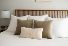
The right amount of white can make a space feel clean and organized, perfect for a kitchen. However, too much white can create feelings of loneliness, so use it purposefully.
Black
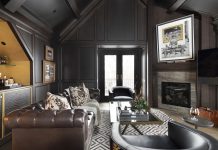
Neutrals like black can tie a room together and create harmony within a space. In addition, it can make inhabitants feel bolder and more confident.


